View Project
Branding
Fruta Fresca
Fruta Fresca
Client
TechInfinity
Discipline
Consumer Goods
Category
Identity System
Location
Mumbai, India
Website
frutafresca.in
About Fruta Fresca
Fruta Fresca is run by two young entrepreneurs striving to carry forward their family legacy while adding their own flavor to it and modernizing the business model by taking it online. They strive to deliver premium quality fruits from across the globe to our fellow Indians at affordable prices and through great customer service. Their fruits are meant to excite the taste buds of one and all, be it a business tycoon or a common man.

Breakdown of the logo
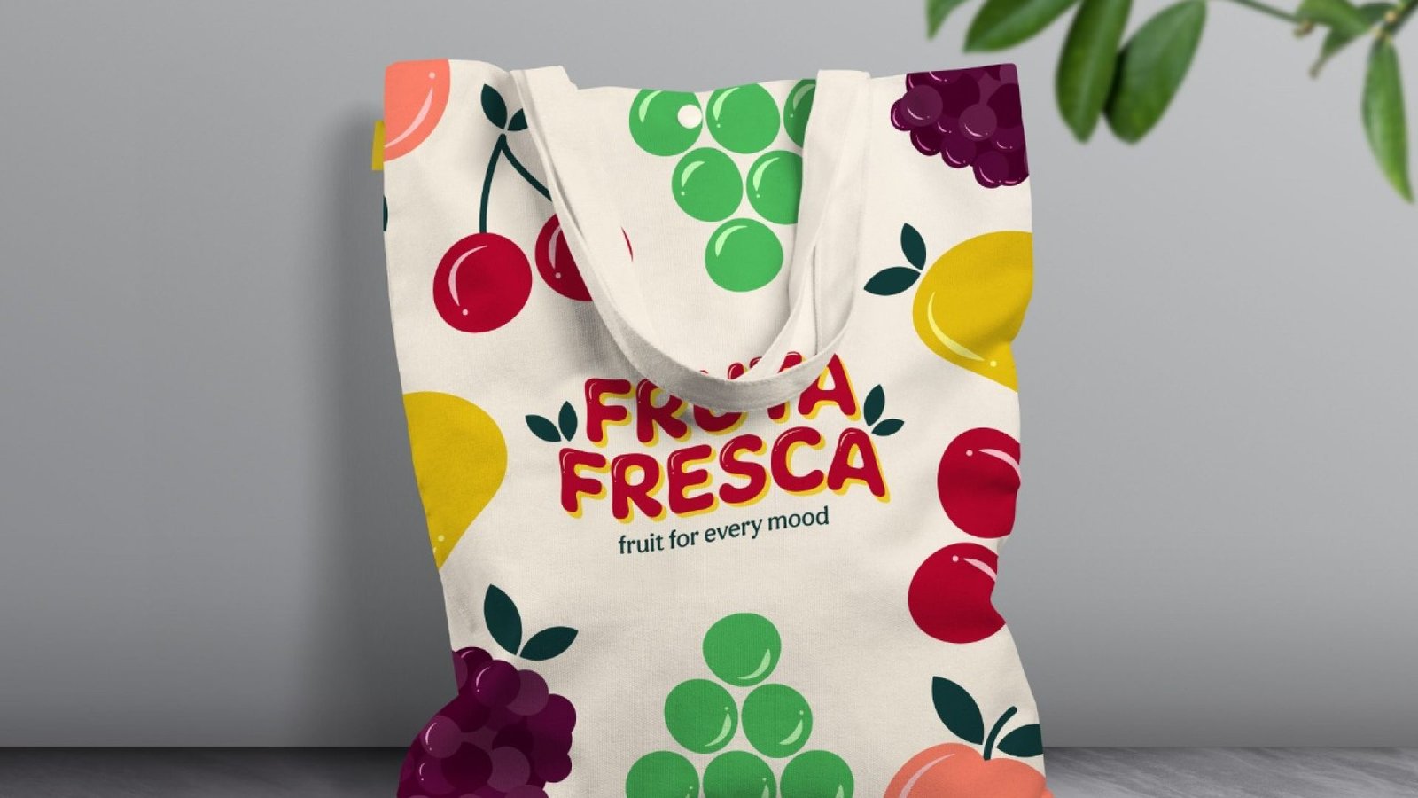
Vibrant. Playful. Organic.
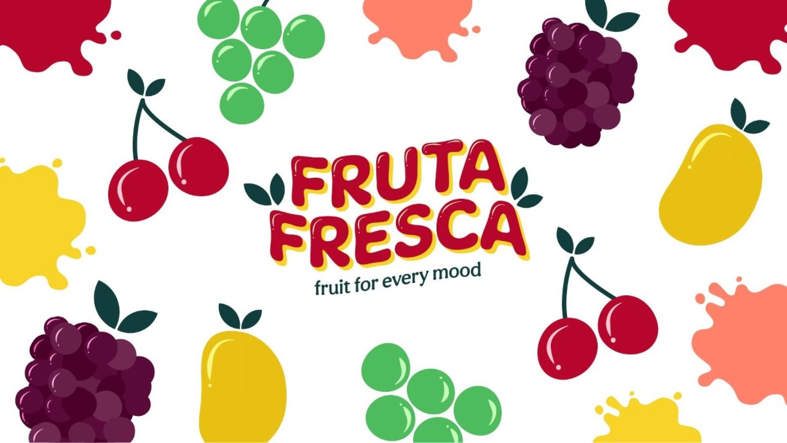
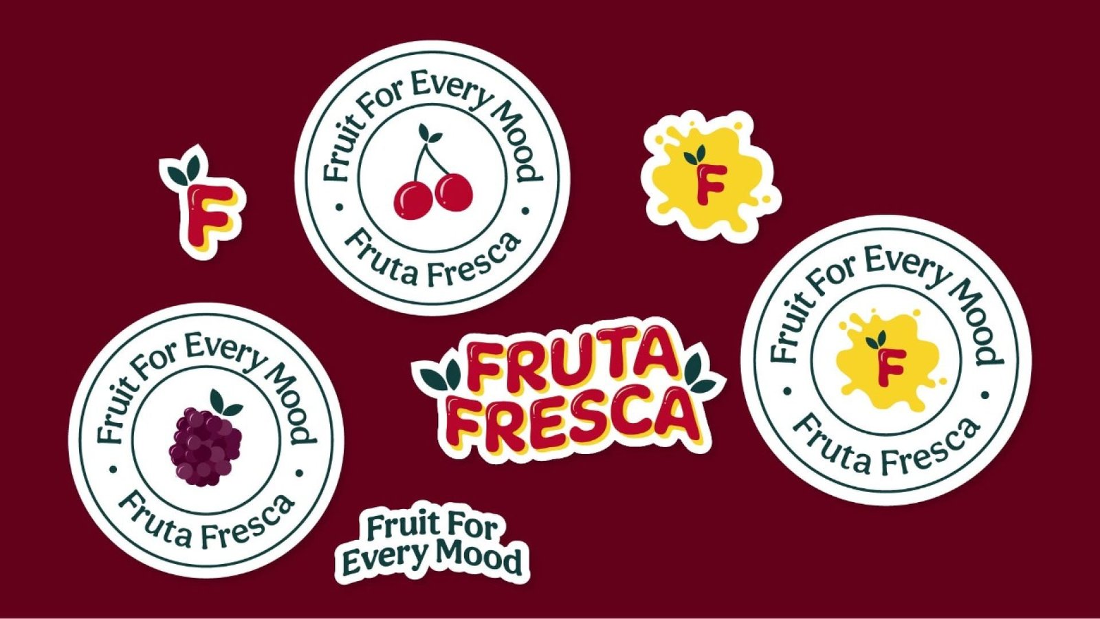
The identity system created embodies the spirit of these attributes. To capture the natural and organic nature of the fruits we worked with organic shapes for the illustrations. Since Fruta Fresca is a fruit distribution company, one of the problems we faced was that, “Can we use a specific fruit in the logo?”. The solution I came up with was to create a wordmark that carries the properties of a fruit. This way we avoided creating the impression of being sellers of just one specific fruit and ended up a logo that looks absolutely delicious! For the icon to tackle the same issue, we went with a splash pattern on the background. The idea behind that is, every fruit is filled with juice and when squeezed creates a splash.
The font used is nice and round on the edges and the highlights gives the impression of the letters being filled with juice and the leaves of course establish the point further. Shades of red and yellow are very common among fruits so I decided to go with them for the primary color palette so that one doesn’t have any trouble associating them with fruits.
