View Project
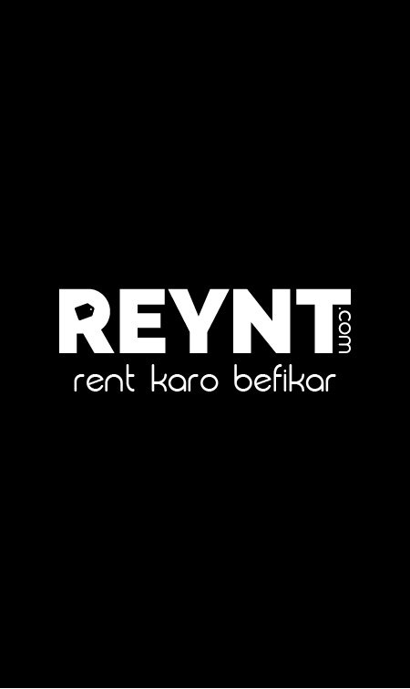
Breakdown of the logo
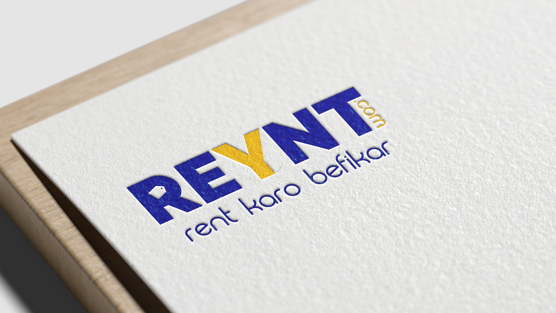
-Mr. Viral Shah and I decided to go for a wordmark for this particular logo so as to make it more dynamic and versatile. The logo can be easily adapted by any category on the rental platform. For example, Reynt Cars, Reynt Bikes etc.
-The letter Y is a fun twist on the word Rent to make it more appealing and memorable.
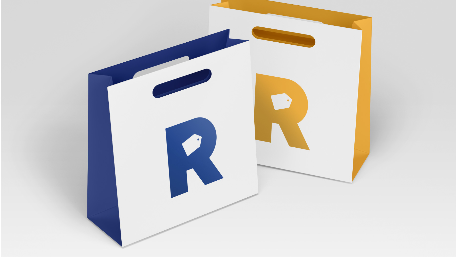
-If you look closely, there's a tag hidden in the letter R suggesting that you can get the same product as a lower price.
-The inclusion of .com in the logo itself makes the domain name really easy to remember for the audience.
-The letter Y is in a different colour to make the word Rent more prominent, making the purpose of the company more obvious and simple to understand.
About Reynt
Reynt is an upcoming online rental solution for all the rental needs. It is an e-commerce platform for all sellers to list their products and buyers to rent good quality products at affordable prices. It caters mainly to the younger generation of today which moves from city to city with the mobile nature of their jobs.
