View Project
HealCare
Client
Anirudh Sharma
Anuksha Khargharia
Discipline
Health and Wellness
Category
Logo Design
Location
Bangalore, India
Website
healcare.in
About HealCare
HealCare is a place for Diagnosis, Self Exploration and Health Management. Their approach is patient centered, healing oriented, emphasizes on therapeutic relationship and uses therapeutic approaches originating from conventional and alternative medicine. This approach enables them to transform your relationship with your mind, body and spirit to that of a healthy, mindful and a well-balanced being.

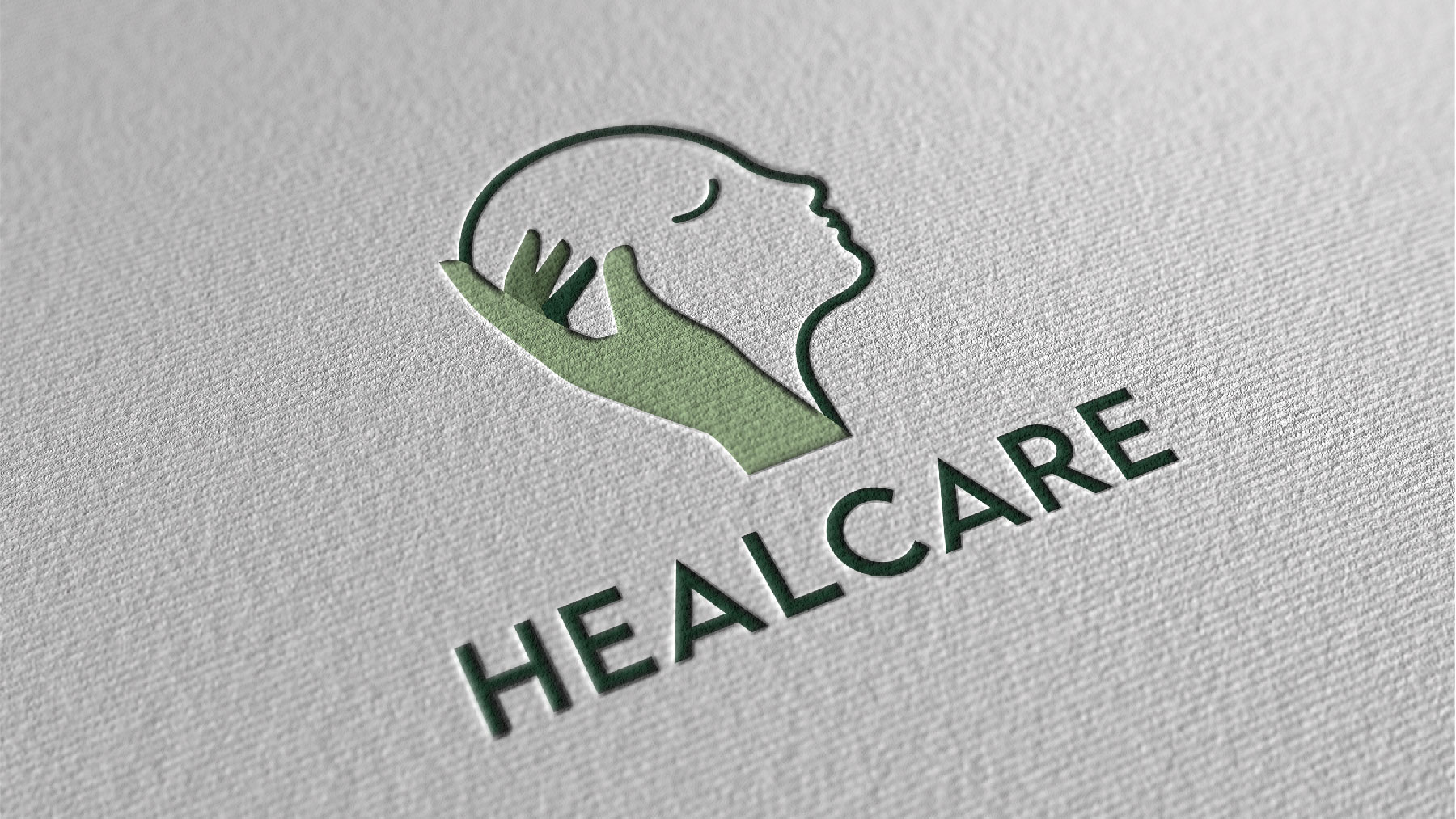
Breakdown of the logo
-The human head silhouette represents their patient-centered approach.
-The hand is positioned in a way to showcase love, care, and the all-round support that one will receive at HealCare.
-The colors are particularly chosen to enhance the vibe of nurturing, peace, and growth.


Logo Explorations
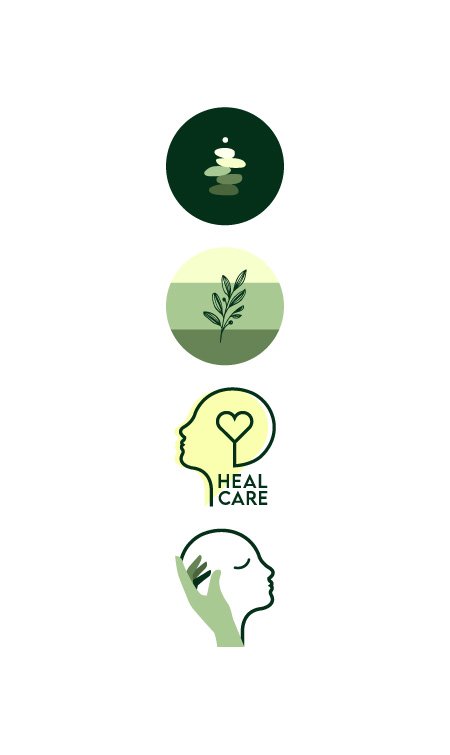
The first logo is is symbolic of the art form of rock balancing. The concept of rock balancing is driven by science and the process is know to be highly meditative which allows us to go deep within ourselves.
The second logo consist of three divisions represented by three different colors for Mind, Body and Spirit. These colors and then enclosed in a circle to represented the holistic approach taken towards the journey of healing by HealCare.
After presenting the first two logos, the clients expressed their wish for the logo being self-explanatory. Thinking on those grounds, the next two logos were derived.

