View Project
Branding
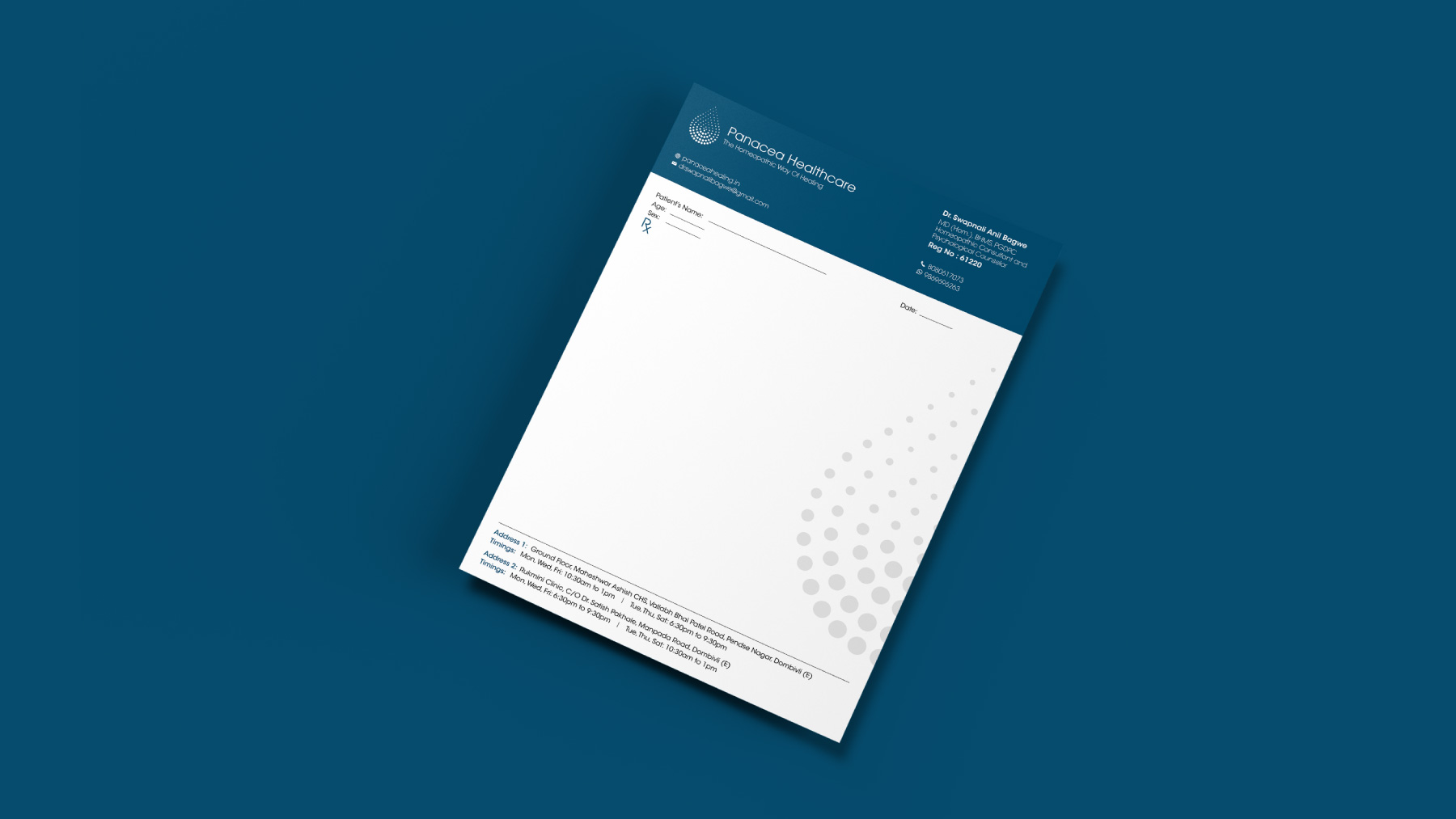
Panacea Healthcare


What is Panacea?
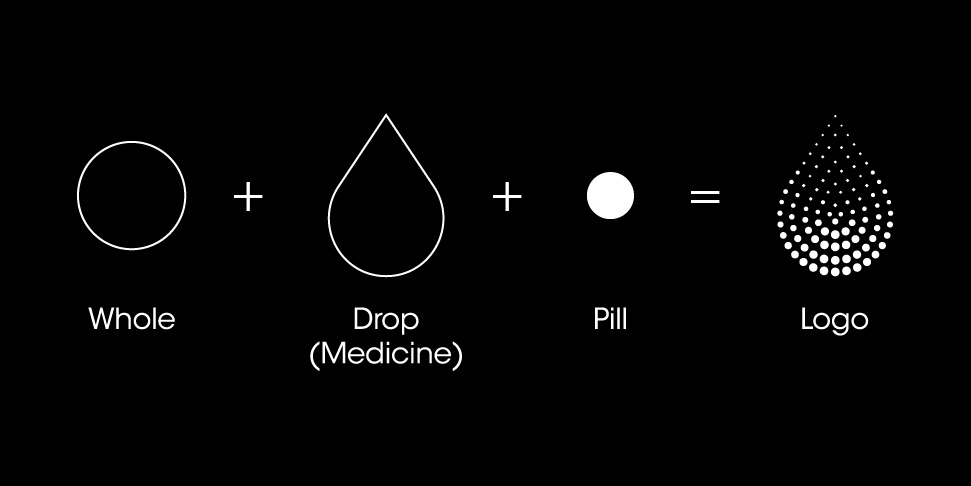
Panacea: A remedy believed to cure all disease and prolong life.
The name of the organisation itself denotes our commitment towards the holistic and gentle healthcare solution to all the ailments thereby enhancing the physical as well as psychological health of the patient. We are committed to cure the ailments of patients from its root cause after studying the person thoroughly.